raw med
Art Direction
Branding
Print
Ilustration
The project was not
implemented
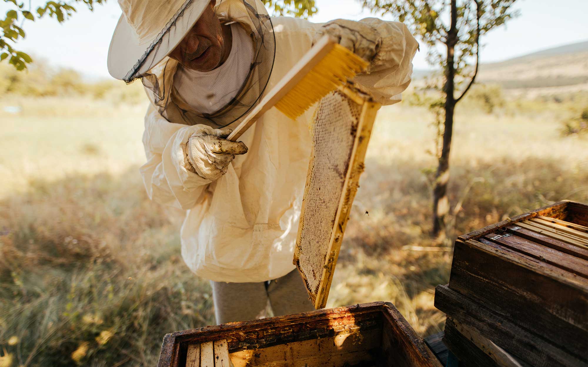
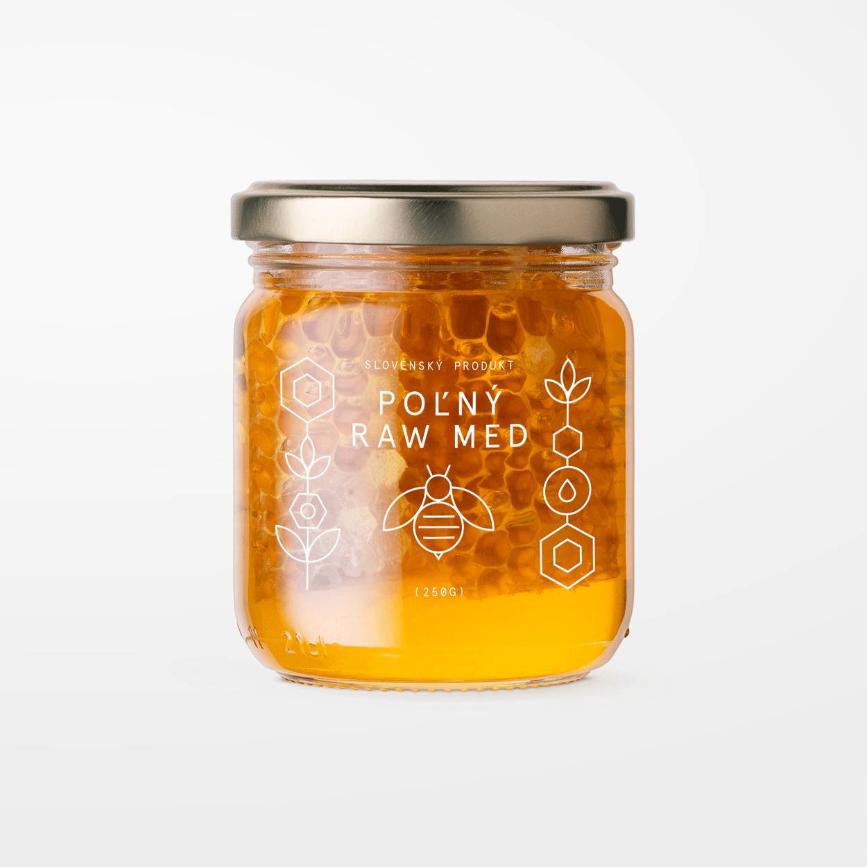
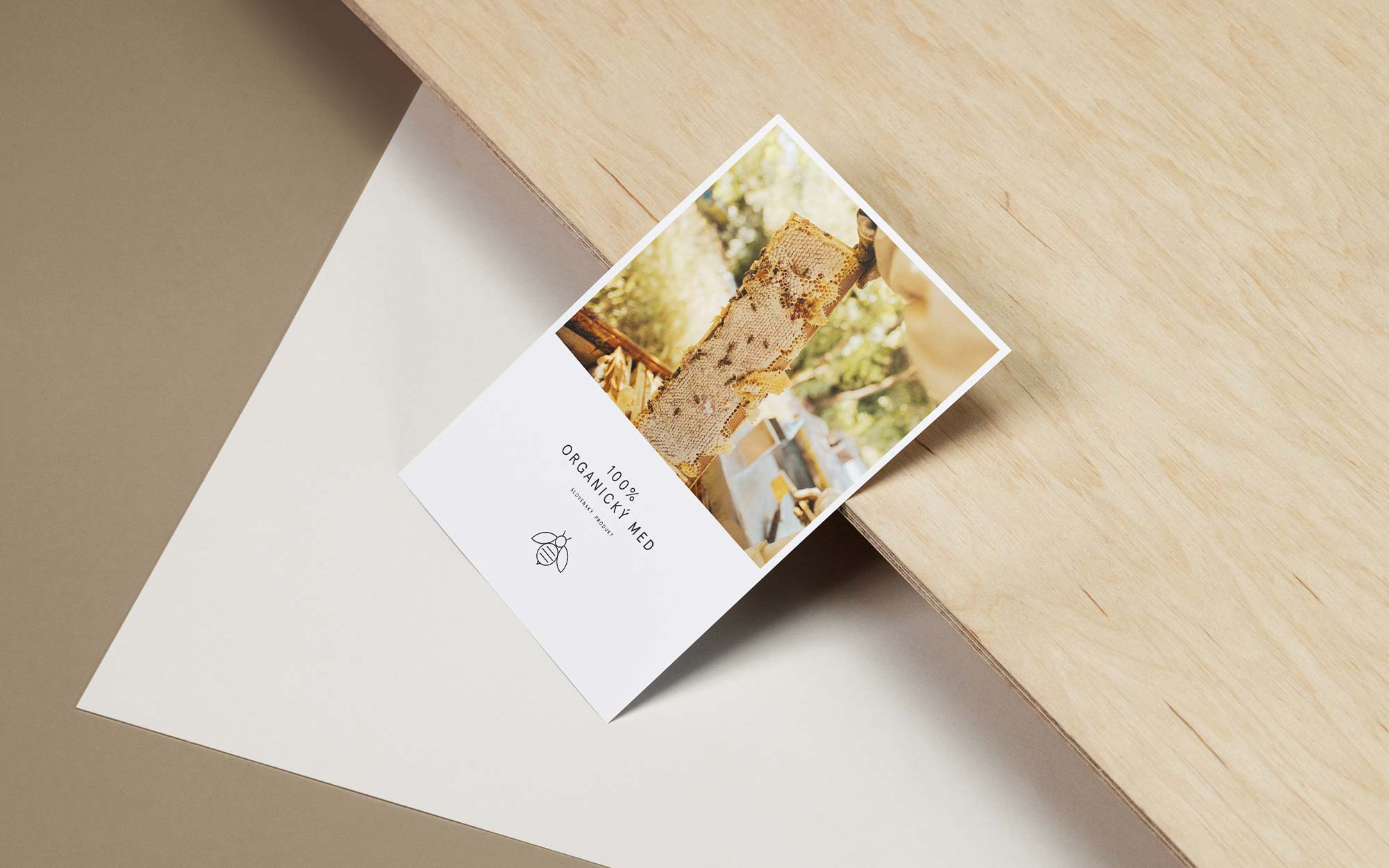
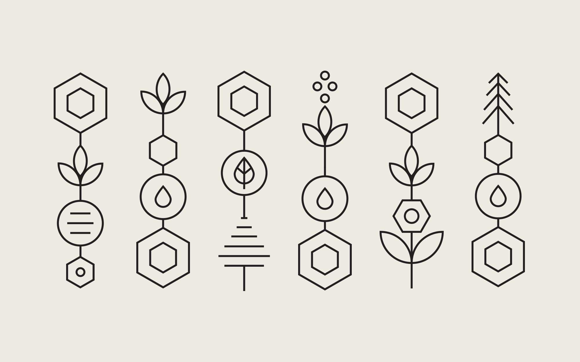
For the project of Slovak “raw” honey, I created the brand identity with a focus on the 100% natural product. All varieties of high-quality honey come from rural areas, produced by manufacturers focused on sustainable beekeeping and the sale of unprocessed natural honey.
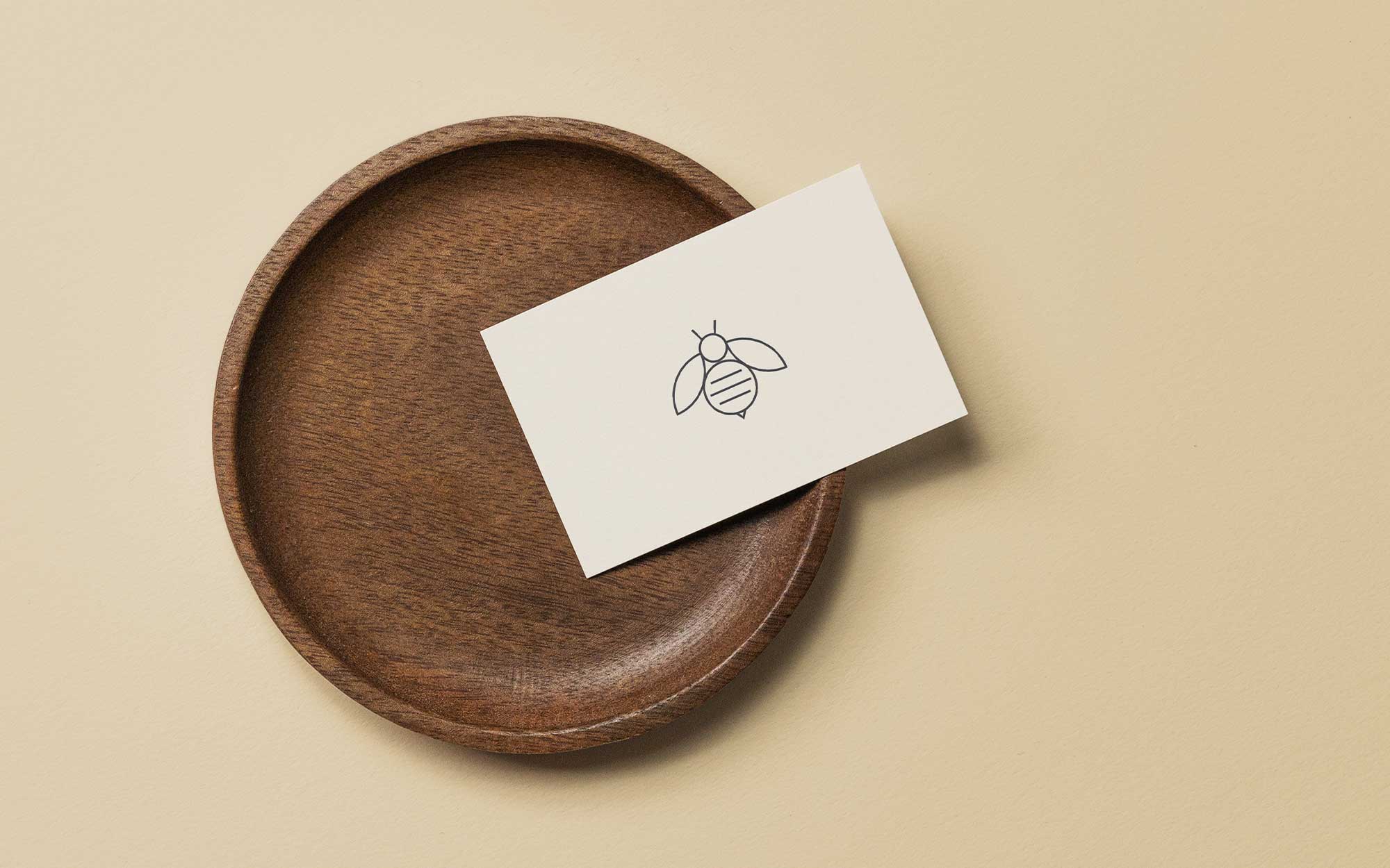
This philosophy is expressed through linear abstract illustrations that visualize the connection with flowers, bees, and honey. All graphic elements are applied to the label in a consistent way to create a strong and cohesive brand image.
Each variety of honey is distinguished by a customized illustration, which, in combination with typography and a subtle color palette, emphasizes the quality, color, and taste of the product.